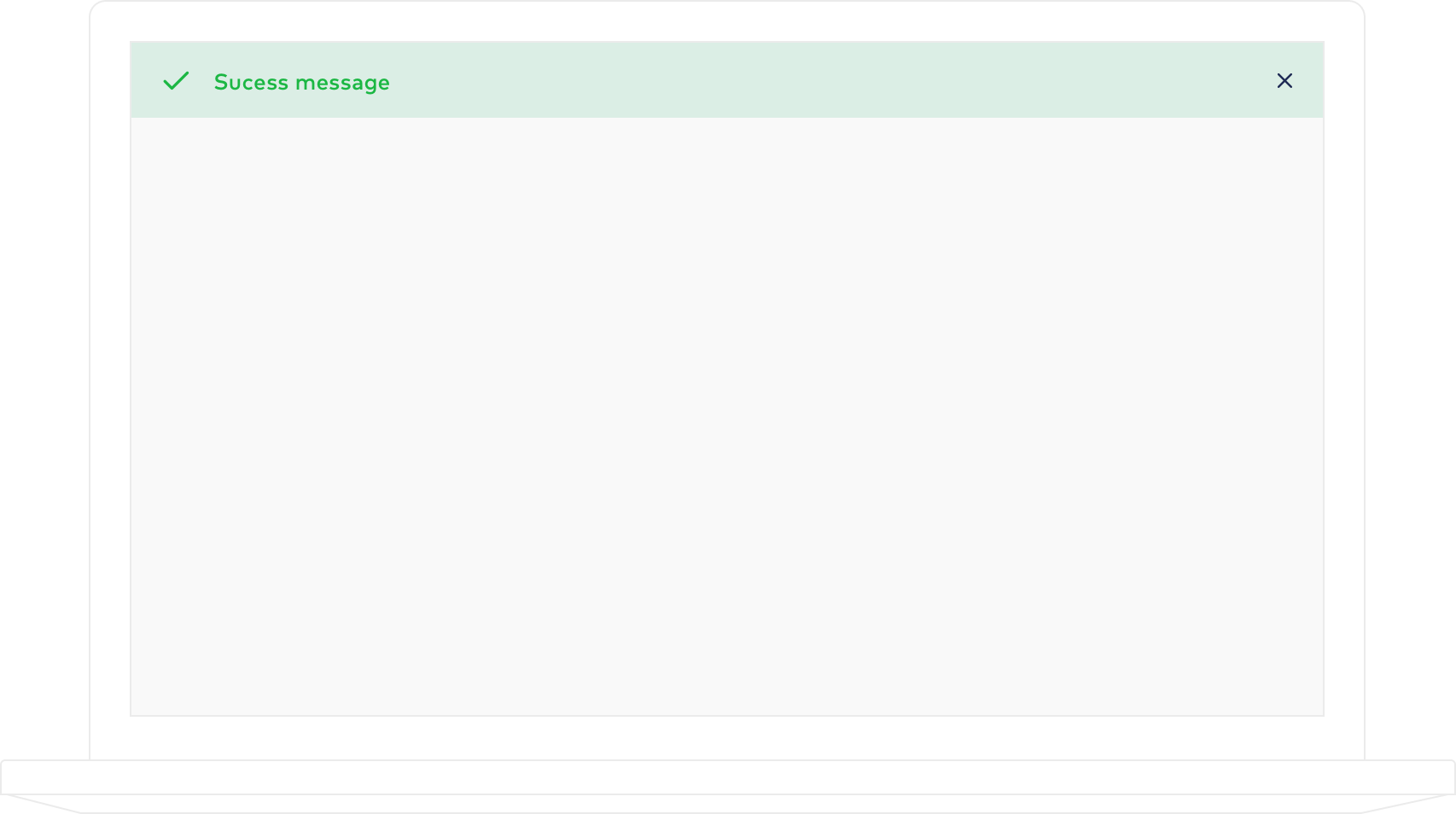
Toast O componente de toast deve ser utilizado como feedback para ações e eventos do sistema. Seu conteúdo pode incluir textos de confirmação, aviso, atualização ou erro.
Feedback Toasts de feedback são utilizados como respostas de ação de usuário. Se posicionam no topo da tela, com largura relativa a 100% do canvas.
Anatomia
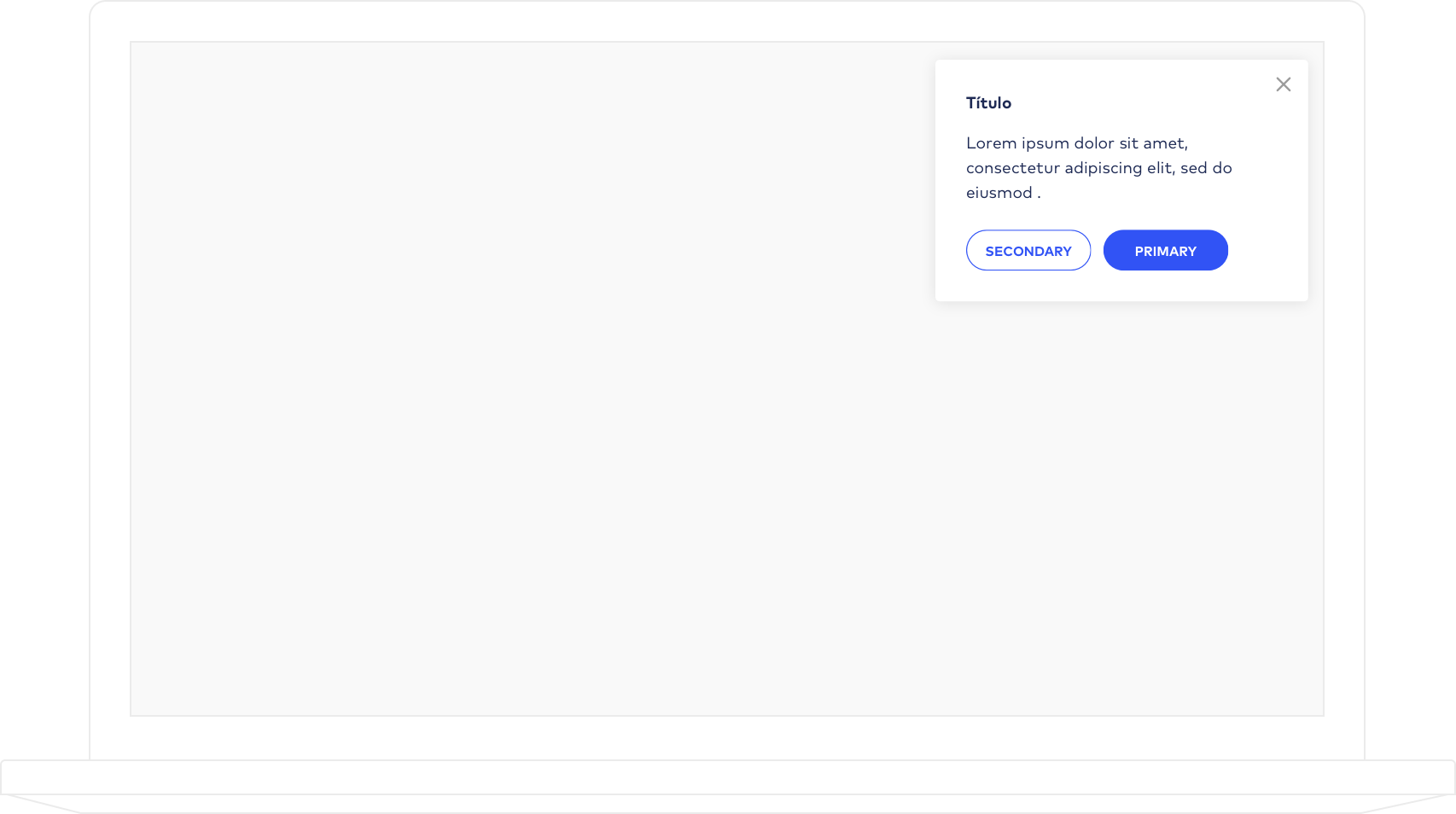
Notificação Podem indicar alertas de atualização do sistema e de seu conteúdo, ou ainda mensagens contextuais não necessariamente atreladas a uma ação específica do usuário.
Anatomia Ação Título Lorem ipsum dolor sit amet, consectetur adipiscing elit, sed do eiusmod.
Secondary Primary Clique para visualizar Notificação Título Lorem ipsum dolor sit amet, consectetur adipiscing elit, sed do eiusmod.
Clique para visualizar
Código Feedback Notification
SASS Copiar código
Exibir código
.feedback{
position: fixed;
top: 0;
z-index: 999;
left: 0;
box-sizing: border-box;
font-family: Lato;
font-size: 1em;
font-weight: bold;
line-height: 24px;
width: 100%;
padding: 15px 20px;
&[data-example="true"]{
position: relative;
z-index:1;
}
&:before{
content: "";
position: relative;
top: -2px;
width: 24px;
height: 24px;
background-repeat: no-repeat;
background-size: 24px;
background-position: 0;
vertical-align: middle;
margin-right: 15px;
float: left;
}
&.success{
background-color: #dbeee5;
color: #1bb743;
&:before{
background-image: url(/img/check-icon.png);
background-size: 20px;
}
}
&.error{
background-color: #fce1da;
color: #f7744a;
&:before{
background-image: url(/img/error-icon.png);
}
}
&.alert{
background-color: #faf2cc;
color: #1e2a54;
&:before{
background-image: url(/img/alert-icon.png);
background-size: 20px;
}
}
&.alert-white{
background-color: #fff;
color: #1e2a54;
&:before{
background-image: url(/img/check-feedback.png);
}
}
button.close{
width: 17px;
height: 18px;
background-image: url(/img/close-modal.png);
background-repeat: no-repeat;
background-size: 12px;
background-position: 3px 6px;
vertical-align: middle;
position: absolute;
background-color: transparent;
border: none;
cursor: pointer;
right: 20px;
bottom: 38%;
}
}
.notification{
display: none;
position: fixed;
top: 7rem;
z-index: 999;
right: 20px;
box-sizing: border-box;
font-family: Lato;
font-size: 1em;
font-weight: bold;
line-height: 24px;
width: 364px;
max-width: 100%;
padding: 30px 30px 20px;
border-radius: 4px;
background-color: #ffffff;
box-shadow: 0 2px 15px 0 rgba(0, 0, 0, 0.1);
h4{
font-family: Lato;
font-size: 1em;
font-weight: bold;
font-style: normal;
font-stretch: normal;
line-height: 1.5;
letter-spacing: normal;
color: #1e2a54;
margin: 0;
padding: 0;
}
p{
margin: 15px 0 25px 0;
font-family: Lato;
font-size: 1em;
font-weight: normal;
font-style: normal;
font-stretch: normal;
line-height: 1.5;
letter-spacing: normal;
color: #1e2a54;
}
button.btn{
margin-right: 10px;
margin-bottom: 10px;
min-width: 120px;
font-weight: bold;
}
button.close{
content: "";
position: absolute;
right: 15px;
top: 15px;
width: 17px;
height: 18px;
background-image: url(/img/close-gray.svg);
background-repeat: no-repeat;
background-size: 12px;
background-position: 3px 6px;
vertical-align: middle;
background-color: transparent;
border: none;
cursor: pointer;
}
}
JS Copiar código
Exibir código
$('body').on('click', '.notification .close', function(e){
e.preventDefault();
$(this).closest('.notification').fadeOut();
});
HTML Copiar código
Exibir código
<div class="notification info">
<h4>Título</h4>
<p>Lorem ipsum dolor sit amet, consectetur adipiscing elit, sed do eiusmod.</p>
<button class="btn outline small"><span class="text">Secondary</span></button>
<button class="btn small"><span class="text">Primary</span></button>
<button class="close"></button>
</div>
SASS Copiar código
Exibir código
.feedback{
position: fixed;
top: 0;
z-index: 999;
left: 0;
box-sizing: border-box;
font-family: Lato;
font-size: 16px;
font-weight: bold;
line-height: 24px;
width: 100%;
padding: 15px 20px;
&[data-example="true"]{
position: relative;
z-index:1;
}
&:before{
content: "";
position: relative;
top: -2px;
width: 24px;
height: 24px;
background-repeat: no-repeat;
background-size: 24px;
background-position: 0;
vertical-align: middle;
margin-right: 15px;
float: left;
}
&.success{
background-color: #dbeee5;
color: #1bb743;
&:before{
background-image: url(/img/check-icon.png);
background-size: 20px;
}
}
&.error{
background-color: #fce1da;
color: #f7744a;
&:before{
background-image: url(/img/error-icon.png);
}
}
&.alert{
background-color: #faf2cc;
color: #1e2a54;
&:before{
background-image: url(/img/alert-icon.png);
background-size: 20px;
}
}
&.alert-white{
background-color: #fff;
color: #1e2a54;
&:before{
background-image: url(/img/check-feedback.png);
}
}
button.close{
content: "";
width: 17px;
height: 18px;
background-image: url(/img/close-modal.png);
background-repeat: no-repeat;
background-size: 12px;
background-position: 3px 6px;
vertical-align: middle;
float: right;
background-color: transparent;
border: none;
cursor: pointer;
}
}
.notification{
display: none;
position: fixed;
top: 7rem;
z-index: 999;
right: 20px;
box-sizing: border-box;
font-family: Lato;
font-size: 16px;
font-weight: bold;
line-height: 24px;
width: 364px;
max-width: 100%;
padding: 30px 30px 20px;
border-radius: 4px;
background-color: #ffffff;
box-shadow: 0 2px 15px 0 rgba(0, 0, 0, 0.1);
transition: .4s;
h4{
font-family: Lato;
font-size: 16px;
font-weight: bold;
font-style: normal;
font-stretch: normal;
line-height: 1.5;
letter-spacing: normal;
color: #1e2a54;
margin: 0;
padding: 0;
}
p{
margin: 15px 0 25px 0;
font-family: Lato;
font-size: 16px;
font-weight: normal;
font-style: normal;
font-stretch: normal;
line-height: 1.5;
letter-spacing: normal;
color: #1e2a54;
}
button.btn{
margin-right: 10px;
margin-bottom: 10px;
min-width: 120px;
font-weight: bold;
}
button.close{
content: "";
position: absolute;
right: 15px;
top: 15px;
width: 17px;
height: 18px;
background-image: url(/img/close-gray.svg);
background-repeat: no-repeat;
background-size: 12px;
background-position: 3px 6px;
vertical-align: middle;
background-color: transparent;
border: none;
cursor: pointer;
}
}
JS Copiar código
Exibir código
$('body').on('click', '.notification .close', function(e){
e.preventDefault();
$(this).closest('.notification').fadeOut();
});
 Produto
 PRODUTO
 Exibir código