 Produto
 PRODUTO
Date-picker
O date-picker oferece ao usuário a opção de selecionar uma data específica ou um período entre datas.
Estados de interação
É uma variação de input com ícone.
Default
Hover
Filled
Focus
Disabled
Mobile
Na exibição mobile, o date-picker deve carregar o componente padrão de cada OS.
Android 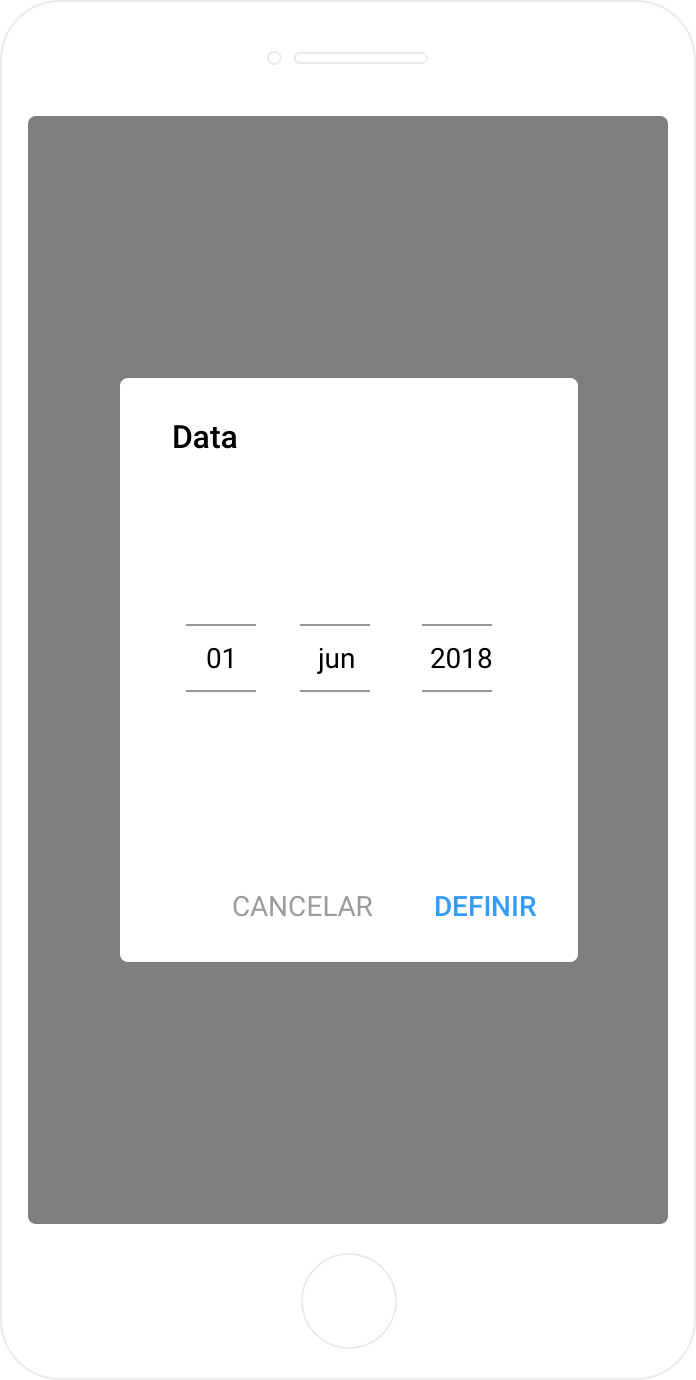
iOS 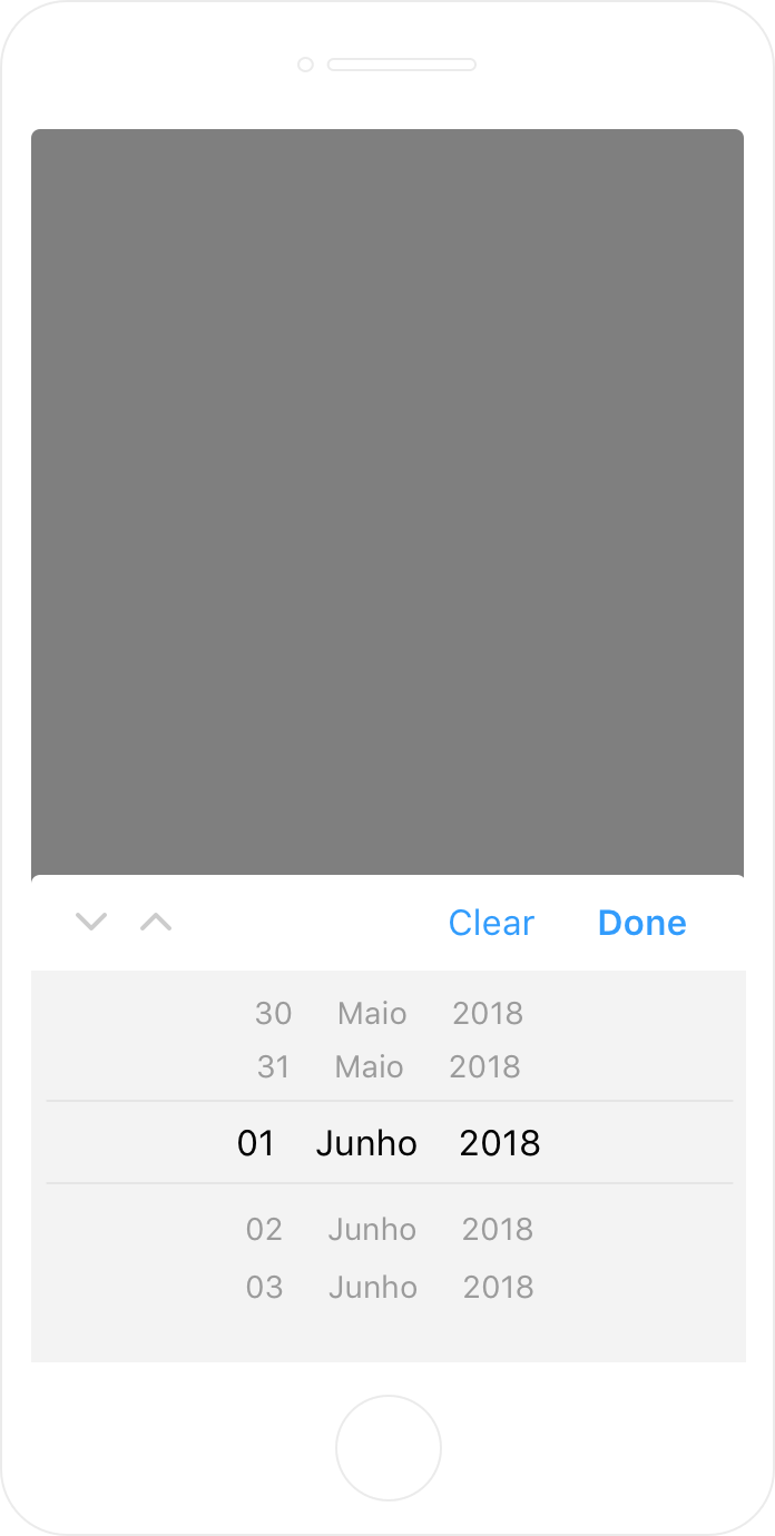
Código
Esse componente utiliza o plugin JQuery UI.
HTML  Exibir código
Copiar código
Exibir código
<div class="text-field date-picker">
<input type="text" placeholder=" " class="text-input" />
<label>Data</label>
<span class="icon">
<svg xmlns="http://www.w3.org/2000/svg" width="21" height="23" viewBox="0 0 21 23">
<path id="calendar-icon" fill="#9b9b9b" fill-rule="evenodd" d="M17.412 20.3h-14c-.55 0-1-.45-1-1v-9h16v9c0 .55-.449 1-1 1m-14-16h2v1a1 1 0 0 0 2 0v-1h6v1a1 1 0 0 0 2 0v-1h2c.551 0 1 .449 1 1v3h-16v-3c0-.551.45-1 1-1m14-2h-2v-1a1 1 0 0 0-2 0v1h-6v-1a1 1 0 0 0-2 0v1h-2c-1.654 0-3 1.346-3 3v14c0 1.654 1.346 3 3 3h14c1.654 0 3-1.346 3-3v-14c0-1.654-1.346-3-3-3"/>
</svg>
</span>
</div>
SASS Exibir código
Copiar código
Exibir código
.date-picker{
span.icon{
#calendar-icon{
transition: .4s;
}
}
&.disabled{
pointer-events: none;
input,
label{
background-color: #ebebeb;
}
span.icon{
&:before {
content: "";
width: 100%;
height: 100%;
display: block;
position: absolute;
left: 0;
background-color: transparent;
}
}
}
&:hover,
input.hovered ~ span.icon {
#calendar-icon{
fill: #1b68ff;
}
}
input:focus ~ span.icon,
input.focused ~ span.icon {
#calendar-icon{
fill: #0143e0;
}
}
}
.ui-datepicker{
position: absolute!important;
left: 0!important;
top: initial!important;
margin-top: 10px;
width: 18.6em;
border-radius: 4px;
background-color: #ffffff;
box-shadow: 0 2px 15px 0 rgba(0, 0, 0, 0.1);
border: none!important;
padding: 8px 20px;
box-sizing: border-box;
.ui-datepicker-header {
font-family: Lato;
font-size: 1em;
font-weight: normal;
font-style: normal;
font-stretch: normal;
line-height: 1.5;
letter-spacing: normal;
text-align: center;
color: #323232;
background-color: #fff;
border: none;
.ui-datepicker-prev{
border: none!important;
background-color: #fff;
left: 0!important;
top: 0!important;
}
.ui-datepicker-next{
border: none!important;
background-color: #fff;
right: 0!important;
top: 0!important;
}
.prev-month,
.next-month{
position: relative;
display: block;
background-image: url(/img/chevron-right.png);
background-size: 23px;
width: 20px;
height: 20px;
cursor: pointer;
}
.prev-month{
top: 3px;
transform: rotate(-180deg);
}
}
.ui-datepicker-calendar {
display: table;
overflow: auto;
font-size: inherit;
tr {
border: none;
background-color: #fff;
th {
font-family: Lato;
font-size: 1em;
font-weight: bold;
font-style: normal;
font-stretch: normal;
line-height: 1.5;
letter-spacing: normal;
text-align: center;
color: #323232;
}
td{
&, span, a{
border: 1px solid transparent;
background-color: #fff!important;
font-family: Lato;
font-weight: normal!important;
font-style: normal;
font-stretch: normal;
line-height: 1.71;
letter-spacing: normal;
text-align: center;
color: #7f7f7f;
}
a{
font-size: 0.875em;
width: 30px;
box-sizing: border-box;
height: 29px;
transition: 0s;
&:hover{
color: #1b68ff;
border-radius: 30px;
border: 1px solid #1b68ff;
text-decoration: none;
}
}
}
}
}
}
JS Exibir código
Copiar código
Exibir código
var width = (window.innerWidth > 0) ? window.innerWidth : screen.width;
if(width>767){
$('.date-picker:not(.disabled) input').datepicker({
beforeShow: function(input, obj) {
$(input).closest('.text-field').append($(input).datepicker('widget'));
},
dateFormat: 'dd/mm/yy',
dayNames: ['Domingo','Segunda','Terça','Quarta','Quinta','Sexta','Sábado','Domingo'],
dayNamesMin: ['D','S','T','Q','Q','S','S','D'],
dayNamesShort: ['D','S','T','Q','Q','S','S','D'],
monthNames: ['Janeiro','Fevereiro','Março','Abril','Maio','Junho','Julho','Agosto','Setembro','Outubro','Novembro','Dezembro'],
monthNamesShort: ['Jan','Fev','Mar','Abr','Mai','Jun','Jul','Ago','Set','Out','Nov','Dez'],
showOtherMonths: true,
selectOtherMonths: true,
prevText: '<i class="prev-month"></i>',
nextText: '<i class="next-month"></i>'
});
}else
$('.date-picker').attr('type','date');