 Produto
 PRODUTO
Modal View
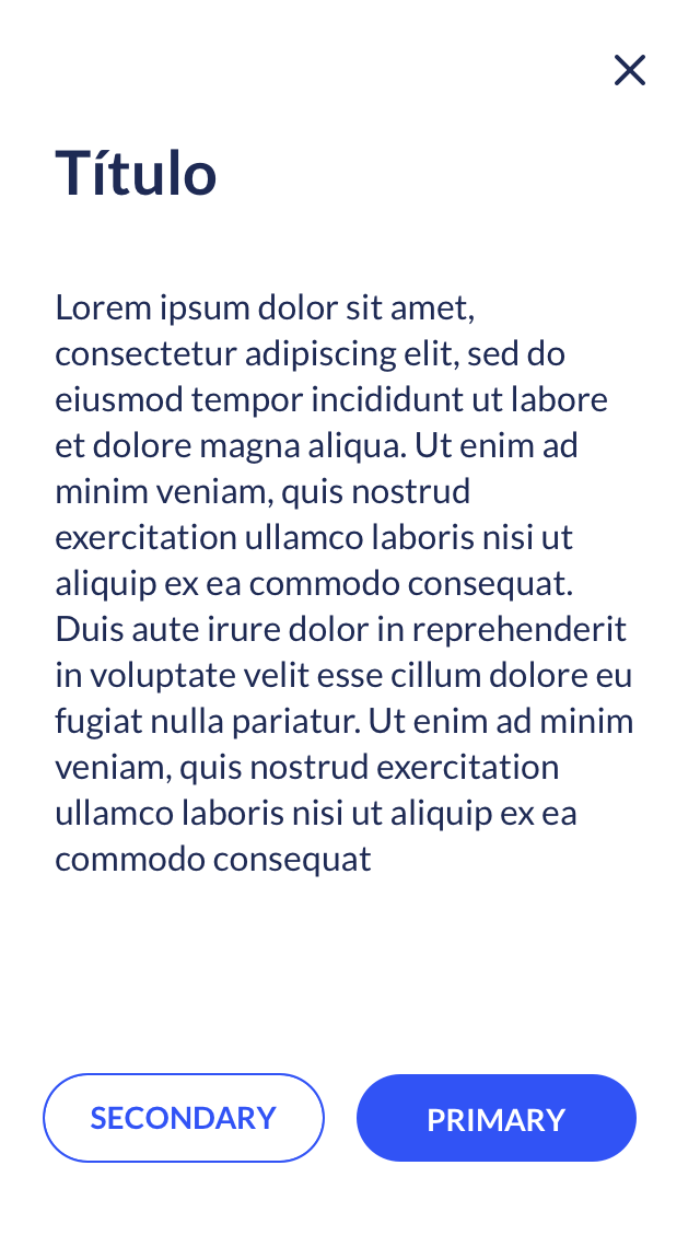
O componente de modal view é utilizado para exibir um segundo layer de informação na página, mantendo claro ao usuário o contexto de origem.
Tipos
O modal view pode se apresentar em 2 tamanhos, dependendo da quantidade de informação a ser exibida por meio dele. Sua largura é sempre relativa ao grid da página, variando entre a largura de 4 colunas ou 8 colunas do grid.
Modal view small
Modal view large
Mobile
Código
HTML  Exibir código
Copiar código
Exibir código
<div id="large" class="modal large">
<div class="modal-content">
<button class="close"></button>
<div class="modal-header">
<h3>Modal view grande</h3>
</div>
<div class="modal-body">
<p>
Lorem ipsum dolor sit amet, consectetur adipiscing elit, sed do eiusmod tempor incididunt ut labore et dolore magna aliqua. Ut enim ad minim veniam, quis nostrud exercitation ullamco laboris nisi ut aliquip ex ea commodo consequat. Duis aute irure dolor in reprehenderit in voluptate velit esse cillum dolore eu fugiat nulla pariatur. Excepteur sint occaecat cupidatat non proident, sunt in culpa qui officia deserunt mollit anim id est laborum
</p>
</div>
<div class="modal-footer">
<button class="btn outline"><span class="text">Secondary</span></button>
<button class="btn"><span class="text">Primary</span></button>
</div>
</div>
</div>
SASS Exibir código
Copiar código
Exibir código
.modal{
display: none;
position: fixed;
z-index: 999;
padding-top: 10rem;
left: 0;
top: 0;
width: 100%;
height: 100%;
overflow: auto;
background-color: rgba(0,0,0,0.5);
.modal-content{
position: relative;
border-radius: 4px;
background-color: #ffffff;
box-shadow: 0 2px 15px 0 rgba(0, 0, 0, 0.15);
max-width: 100%;
margin: auto;
box-sizing: border-box;
margin-bottom: 20rem;
.modal-header{
display: block;
float: left;
width: 100%;
margin-bottom: 50px;
h1,
h2,
h3,
h4,
h5{
font-family: Lato;
font-size: 1.75em;
font-weight: bold;
font-style: normal;
font-stretch: normal;
line-height: 1.43;
letter-spacing: normal;
color: #1e2a54;
margin: 0;
padding: 0 20px 0 0;
}
}
.modal-body{
display: block;
float: left;
width: 100%;
margin-bottom: 100px;
p{
margin: 0;
padding: 0;
font-family: Lato;
font-size: 1em;
font-weight: normal;
font-style: normal;
font-stretch: normal;
line-height: 1.5;
letter-spacing: normal;
color: #1e2a54;
max-width: 90%;
}
}
.close{
border: none;
outline: none;
position: absolute;
right: 30px;
top: 40px;
background-image: url(/img/close-modal.png);
background-repeat: no-repeat;
background-size: 16px;
background-color: transparent;
width: 16px;
height: 16px;
cursor: pointer;
}
}
&.large{
.modal-content{
width: 50%;
padding: 50px;
}
.modal-footer{
button{
margin-right: 30px;
margin-bottom: 20px;
}
}
}
&.small{
.modal-content{
width: 33%;
padding: 30px;
}
.modal-footer{
button{
margin-right: 10px;
margin-bottom: 20px;
min-width: 140px;
}
}
}
@media(max-width: $MQMobile){
padding: 0;
.modal-header{
h1,
h2,
h3,
h4,
h5{
margin-top: 60px!important;
}
}
.modal-content{
width: 100%!important;
height: auto;
min-height: 100%;
border-radius: 0;
margin-bottom: 0;
}
}
}
JS Exibir código
Copiar código
Exibir código
$('body').on('click', '.modal-toggle', function(e){
e.preventDefault();
$($(this).data('modal')).fadeIn();
});
$('body').on('click', '.modal .close', function(e){
e.preventDefault();
$(this).closest('.modal').fadeOut();
});
$('body').on('click', '.modal', function(e){
if(!$(e.target).closest('.modal-content').length && !$(e.target).is('.modal-content'))
$(this).fadeOut();
});